When the smartphone era dawned, a brand-new challenge for webmasters and designers came with it: How do you make a website that is designed to look great on a computer monitor look just as good on a screen that is a fraction of the size?
Enter responsive design. Two words that have revolutionized web design.
- 1. Simplicity is the Ultimate Sophistication
- 2. Speed is Paramount
- 3. Make Interaction Effortless
- 4. Make Your Content Easy to Digest
- 5. Make Your Text Legible
- 6. Test Your Site Regularly
- 7. Eliminate Non-essential Form Fields
- 8. Avoid Intrusive Interstitials
- 9. Don’t Break the Norm of Established Conventions
- 10. Avoid the Slippery Slope of Desktop Design
- Conclusion
Did you know that mobile devices account for 53.81% of browsing worldwide? Smartphones have taken over as the most common way to access and browse the internet.
So, how can you improve the responsiveness of your website to ensure success in 2020 and beyond?
The first step would be to choose a web hosting provider known for top-notch site speed so you’re set up for success from the start. If you use WordPress then you should check out our performance comparison of popular WordPress hosts.
But let’s go beyond that and get into the other ten crucial steps to improve mobile responsiveness…
1. Simplicity is the Ultimate Sophistication
Screen real estate is a precious commodity and you should make the most of the space that you have. One sure-fire way in which to lose visitors quickly is having a bunch of complicated and unnecessary elements that don’t add value to your visitor’s experience.
Did you know the human attention span is shorter than a goldfish’s? You have 6-8 seconds to make an impact.
The sites that users respond the best to are the ones that are clear and to the point. This simple principle can make the difference between success and failure when it comes to things like on-page copy and calls to action, and is, therefore, one of the most effective ways to improve the responsiveness of your website.

For example, you should aim to provide mobile site users with as much information as possible in as little words as possible.
2. Speed is Paramount
When we think of mobile responsiveness, we tend to lean towards the aesthetics of web design and can often overlook page speed. Put simply, you can have a beautifully designed website but if it doesn’t load fast then the responsive design becomes somewhat redundant. The longer your site takes to load, the more likely your visitors are to bounce and visit competitor sites. As a result, it is paramount that you make your WordPress website load as fast possible for mobile visitors.
When webmasters think about page speed performance, they can get caught up focusing all efforts towards achieving a fast full load time, but this is a common mistake. How a user perceives load time is determined by multiple factors. So, what should you focus on?
User-centric performance metrics.
Think about when you browse the web, you expect to see visual feedback and to be able to interact with a page within a few seconds of loading it, right? The same can be said for users who land on your mobile site. You need to reassure them that the page is loading.
There are two user-centric performance metrics worth paying attention to:
| Performance Metric | Experience | Fast (ms)* | Moderate (ms)* | Slow (ms)* |
| First Contentful Paint (FCP) | Is it happening? | <1000 | <3000 | >=3000 |
| First Input Delay (FID) | Is it usable? | <100 | <300 | >=300 |
*Connection: Fast 3G
Optimizing your site to deliver fast response times for the right metrics will do wonders for how users perceive the responsiveness of your site. However, it is important to remember that you should measure site speed against a fast 3G connection since this will ensure that your site delivers an exceptional user experience from the lowest end of the scale through to the quickest connection types like WiFi.
How to test your mobile page loading speed
The best tool to test and monitor FCP & FID is WebPageTest.org. Follow these simple steps:
- Enter your URL
- Choose your test location (you can use Google Analytics to see where the majority of your traffic comes from – use this location)
- Open Test Settings and set ‘Connection’ to 3G Fast, and ‘Number of Tests to Run’ to 9.
- Open Chromium Settings and tick ‘Capture Lighthouse Report’, ‘Emulate Mobile Browser’ (use your Google Analytics data to see your device data and select that from the dropdown list), and ‘Capture Dev Tools Timeline’.
- Run the test
- Once the test has completed, click on the ‘Lighthouse PWA Score’
- Your FCP and FID results will be displayed along with any recommended speed optimizations

The key takeaway here is to strike a balance between aesthetics and speed. One thing your site would almost certainly benefit from is a good caching plugin.
3. Make Interaction Effortless
Making your website look good on mobile is the first step to responsiveness, but can often take the limelight off of other equally important factors, such as making your site effortless to use. Your website should be easily accessible no matter what device is used.
One of the key areas of accessibility to pay attention to is tap targets. Tap targets are interactive elements that are clickable by users, such as buttons or links. Appropriately sized tap targets will deliver a seamless browsing experience as well as have a positive influence on your conversion rate since users can easily interact with your site elements.

As a rule of thumb, tap targets that are 48 pixels wide and 48 pixels tall should suffice across all mobile devices. You also need to make sure that there is a minimum of 8 pixels between tap targets.
4. Make Your Content Easy to Digest
Responsive websites are all about the user experience and logically structuring your content helps make that experience so much better.
We’ve written extensively about writing for the web and copywriting before, but making your content easy to digest is more than good structure, proper use of sub-headings, and scannable lists. It is also about presentation and sometimes this means using creative ways to present the content, such as the use of tabs, accordions, charts, tables.
These days this is all much easier thanks to the great page builder plugins which make it easy to implement more sophisticated layouts than you can with the basic WordPress editor. WP Dev Shed uses Beaver Builder, but since implementing this some years ago it is fair to say that Elementor has emerged as the leader in this category with layout widgets for every conceivable need…
In short, the key to success is organizing your content in an easy-to-read fashion. The simple science behind this is that people are impatient – you need to structure your content in an easily digestible way.
5. Make Your Text Legible
The guys and bots over at Google are taking the legibility and ease of reading text rather seriously. So much so that it can affect the search ranking of your website.
It is important to ensure that your text is large enough for a website visitor to read it with ease on a mobile device without needing to zoom in. Luckily, changing font size is a relatively straightforward task to action. You should aim for a minimum of 12px. However, the consensus in the web development and SEO community is to use 16px.
One other aspect of legibility is line-height. Line-height is the amount of space between lines of text. As recommended by Google, you should set line-height to 1.2, meaning that the space between your lines of text is 1.2 times the size of the text itself.
Here’s a great example of a mobile page that is very reader-friendly from Monday.com’s page for collaborating across remote teams.

6. Test Your Site Regularly
Testing your website across multiple devices with different screen sizes will highlight how your website responds and help you to identify any issues before they affect your visitors.
Testing your site across multiple devices and screen sizes may sound complex but there are tools, such as Browser Stack, which are incredibly easy to use and don’t require any advanced web development skills.
It is especially important that you use Google’s mobile-friendly test to evaluate your website’s responsiveness since this is one of the factors that the search giant takes into account when ranking websites.
Many webmasters test their site right after creation but fail to test it regularly afterward, this can lead to poor user experience, especially as websites are constantly being improved and developments could alter the code, creating undesirable effects to your responsive design.
7. Eliminate Non-essential Form Fields
Make it easy for visitors to interact with the forms on your website by removing any non-essential form fields. Simple forms are easier to understand and complete on mobile devices.
Leadpages shared a great post with 10 of the highest converting opt-in pages they’ve ever seen, and sure enough, a common theme is simplicity. The easier you make it for people to opt-in, the more people will do so. Who knew!
Humans have an attention span of between 6-8 seconds and so, by removing non-essential fields you stand a much better chance to keep users engaged. This is especially important for the sales funnel on e-commerce sites. Only request the data that you need from your customers.
8. Avoid Intrusive Interstitials
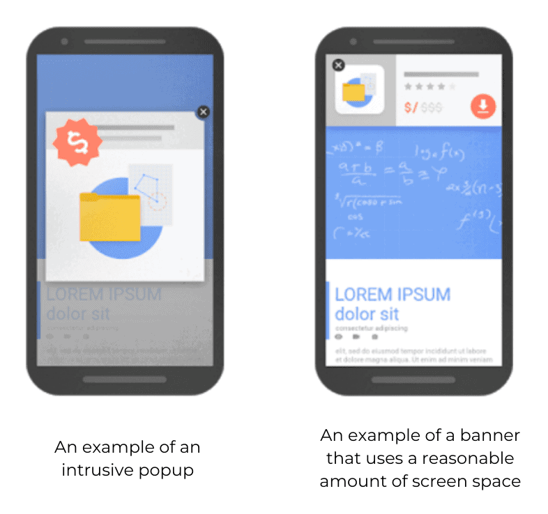
A few years ago, Google announced that they were making a major change to how they determine the accessibility of mobile content by cracking down on intrusive interstitials. Intrusive interstitials can be defined as any pop-up or ad that prevents the main content of a page to be read.
In 2020, the same rules apply. Google’s primary aim is to help users find the content they’re looking for, and this should be yours, too.
While pop-ups can be useful to capture email addresses and new leads, they can frustrate users since they create a barrier between them and the content that they expect to see. This may seem like a minor hindrance but consider this: a user that has already committed to clicking on your search result has a vested interest in your content. This is a crucial moment in the user journey that you should carefully conserve. Ask yourself whether the pop-up adds value to the user. If the answer is no, then remove it.
Not only will removing intrusive interstitials deliver a better mobile experience but you also avoid being pulled down in Google’s search result rankings.
It is important to note that not all pop-ups are bad. After all, some are essential to abide by the law, such as cookie usage and GDPR protocol. You can still use pop-ups on your website but stick by these four rules:
- Ensure they add value
- Don’t obscure the content behind them
- Use device-specific display rules
- Only use a reasonable amount of screen space

9. Don’t Break the Norm of Established Conventions
This one is really important. Users browsing the web on mobile devices intuitively know how to scroll, navigate websites, and find the information they need. Don’t try to implement novel forms of navigation that require users to stop and think. Instead, play into established conventions by making your navigational menus easy to interact with.
No matter what the device, your site’s navigation should be positioned at the top of your pages, and depending on the size of your site they should effectively house links to key pages for users to click and start their journey through your site.

If you are unsure of which links to include you can set up event tracking using Google Analytics or Google Tag Manager to monitor menu link clicks. Not only will this highlight the most frequently clicked links but it will also give you an insight into which menu items aren’t interacted with.
You can use this data to simplify your menu and ultimately, sculpt your site’s navigation to play into the hand of your users. Check out my post on data visualization tools for recommendations on viewing and analyzing this data.
10. Avoid the Slippery Slope of Desktop Design
You’ve heard it a million times before but the best way to ensure mobile responsiveness is to design your website for mobile devices from the ground up.
Because web design is so intrinsically linked to thinking wider, more conceptually, on a larger canvas, many developers and designers still design using a desktop-first approach. We like to think that we have a mobile-first mindset, but this can often fall short.
Websites can be scaled up for use on larger screens more easily than they can be scaled down for use on smaller screens. After all, going mobile-first forces you to consider which elements of the page are most important.
Conclusion
Educate yourself on responsive design and keep up-to-date with the latest trends because they are constantly evolving. What was cutting edge yesterday could be considered old news tomorrow. If you remember the rules and play by them, you are sure to be a success in the digital arena.

2 thoughts on “10 Ways To Improve Mobile Responsiveness”
This is fantastic coming from one of the fastest growing blog owned by adam enfroy himself. great to read his article here on mobile responsiveness and i must say that i gained a lot from these ways especially the “making your content easy to digest” way which i believe will help a lot for me.
Thanks for this amazing article.
very nice info thanks for providing us.